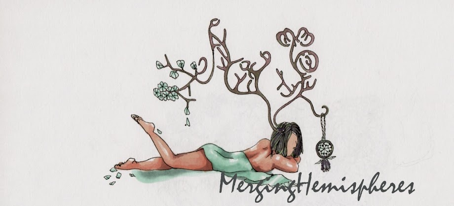
Sometimes when you design something that is in demand in the society these days, subconsciously you become influenced by all the concepts out there. in the beginning all I can think of is the tree pose, the lotus, and all sorts of typography.
What I learned in this project, is to really understand your client, your creativity resourcing from the true creator of the business generates the best image.
But of course, it is a plus plus when your client appreciates your art and techniques at the first place.

ommmm....:)

Finally, passion is the key:)
It looks like a person sitting on/inside 3 petals? The logo is a bit feminine to me, and I feel like you are going to use soft pastel colour.
ReplyDeletethis was the very beginning one.. the last one is totally different:)
ReplyDelete